
Brand Identity Design
Concept Development
Ask: Creation of a branding and visual identity system that includes marketing collaterals:
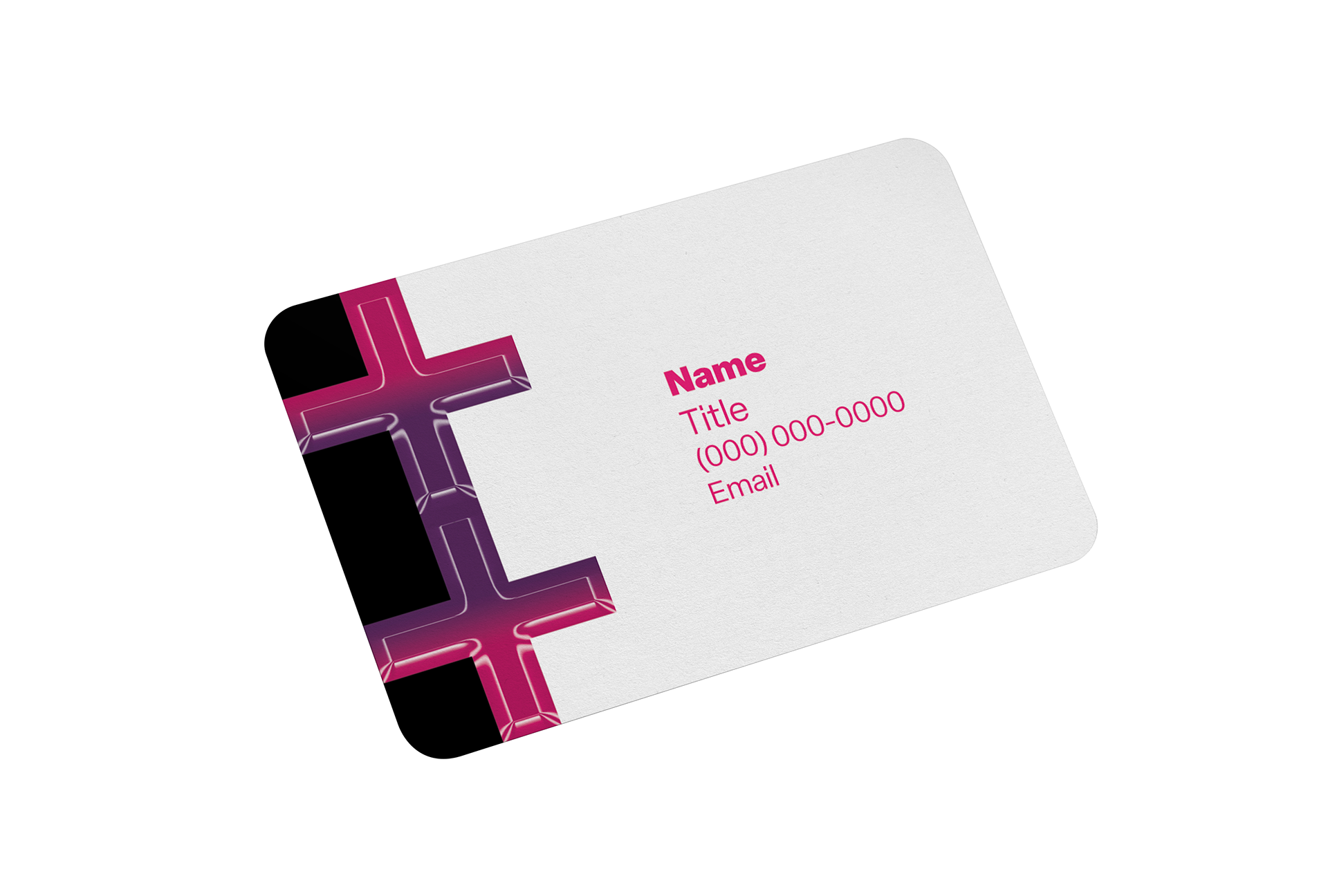
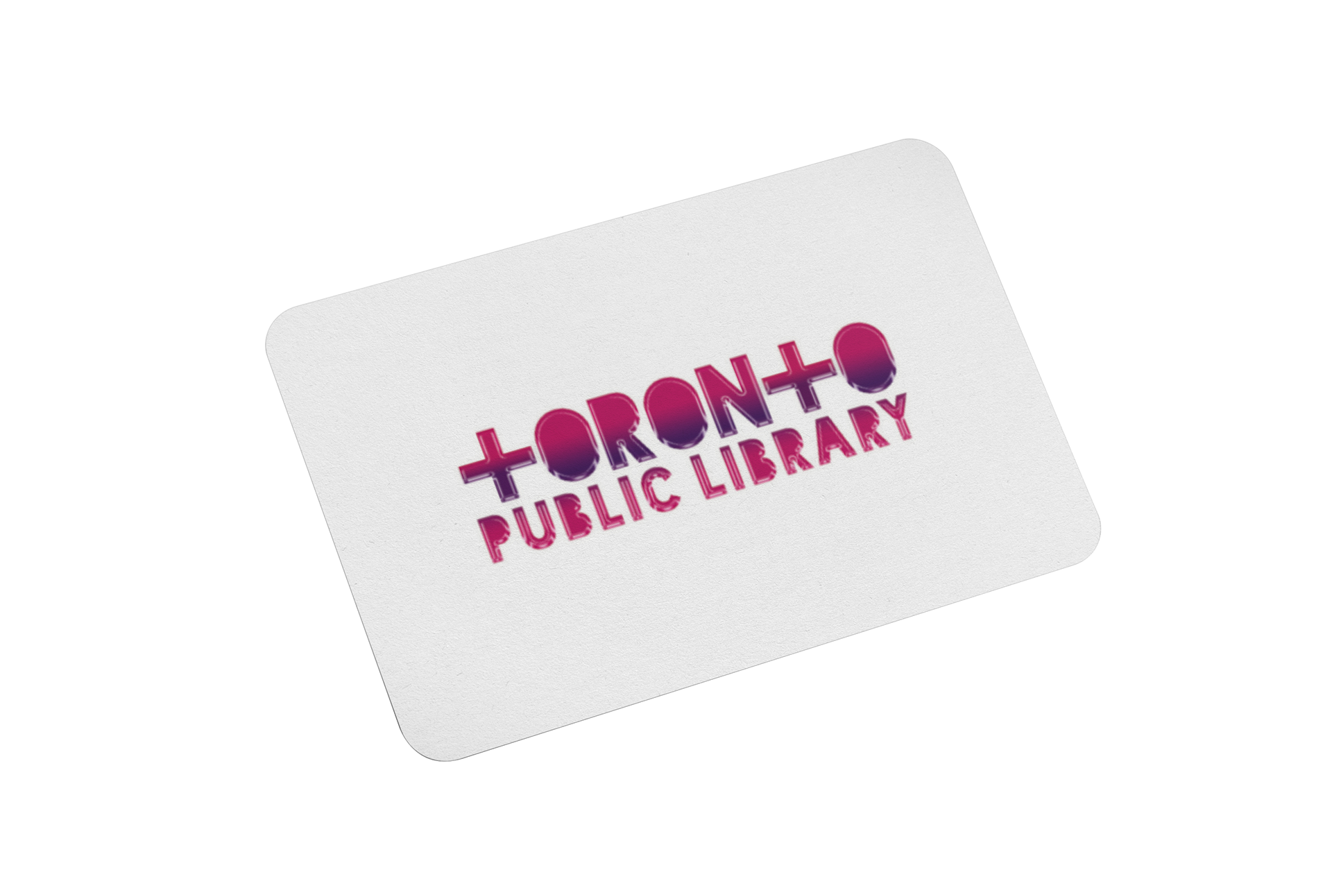
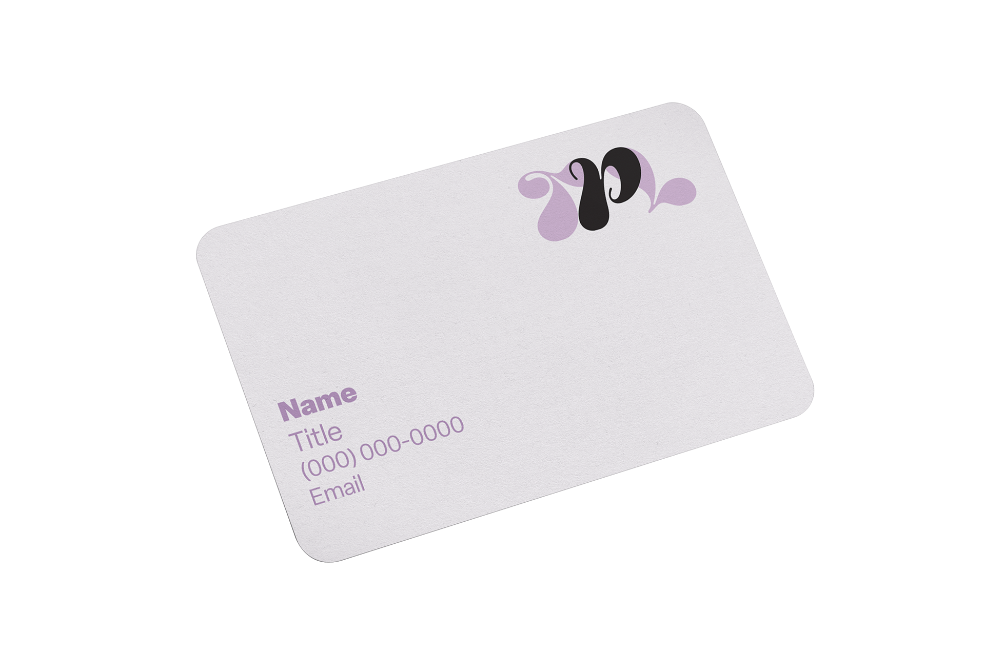
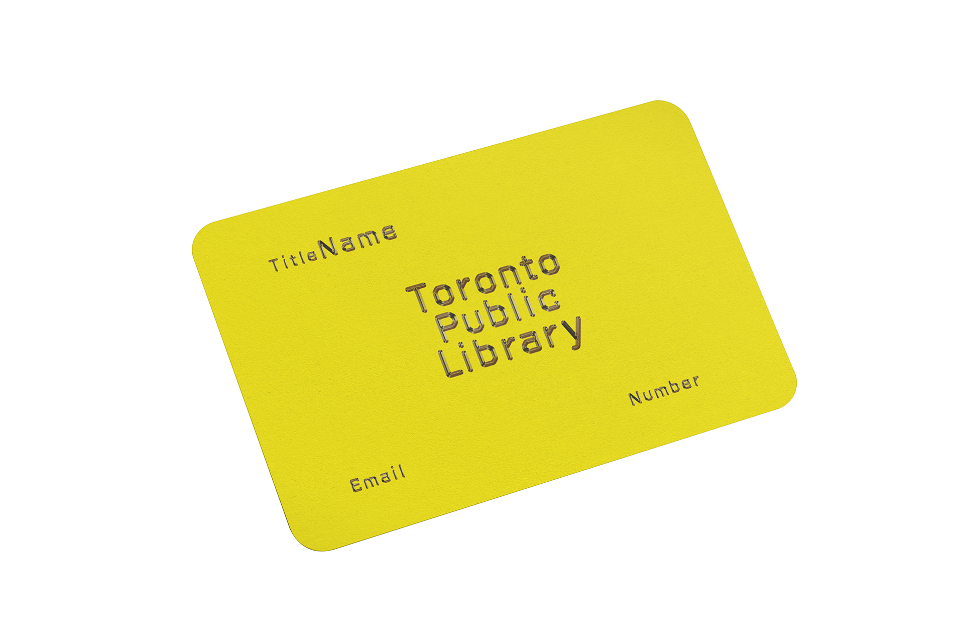
Business Card Template
Digital Display Banner Ad
Poster
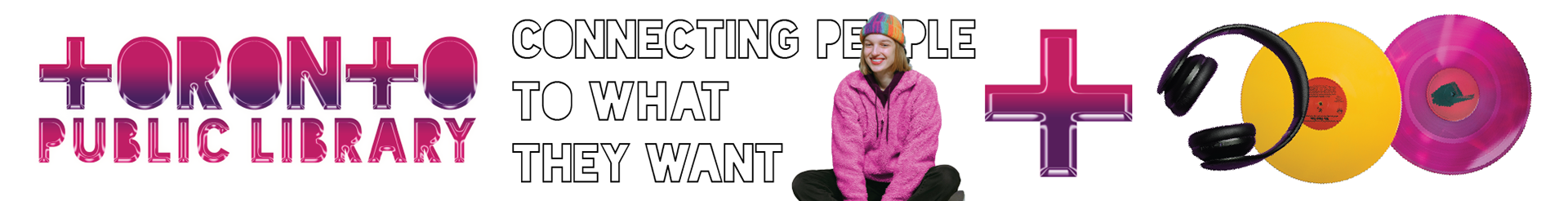
LinkedIn Header Image
Business Card Template
Digital Display Banner Ad
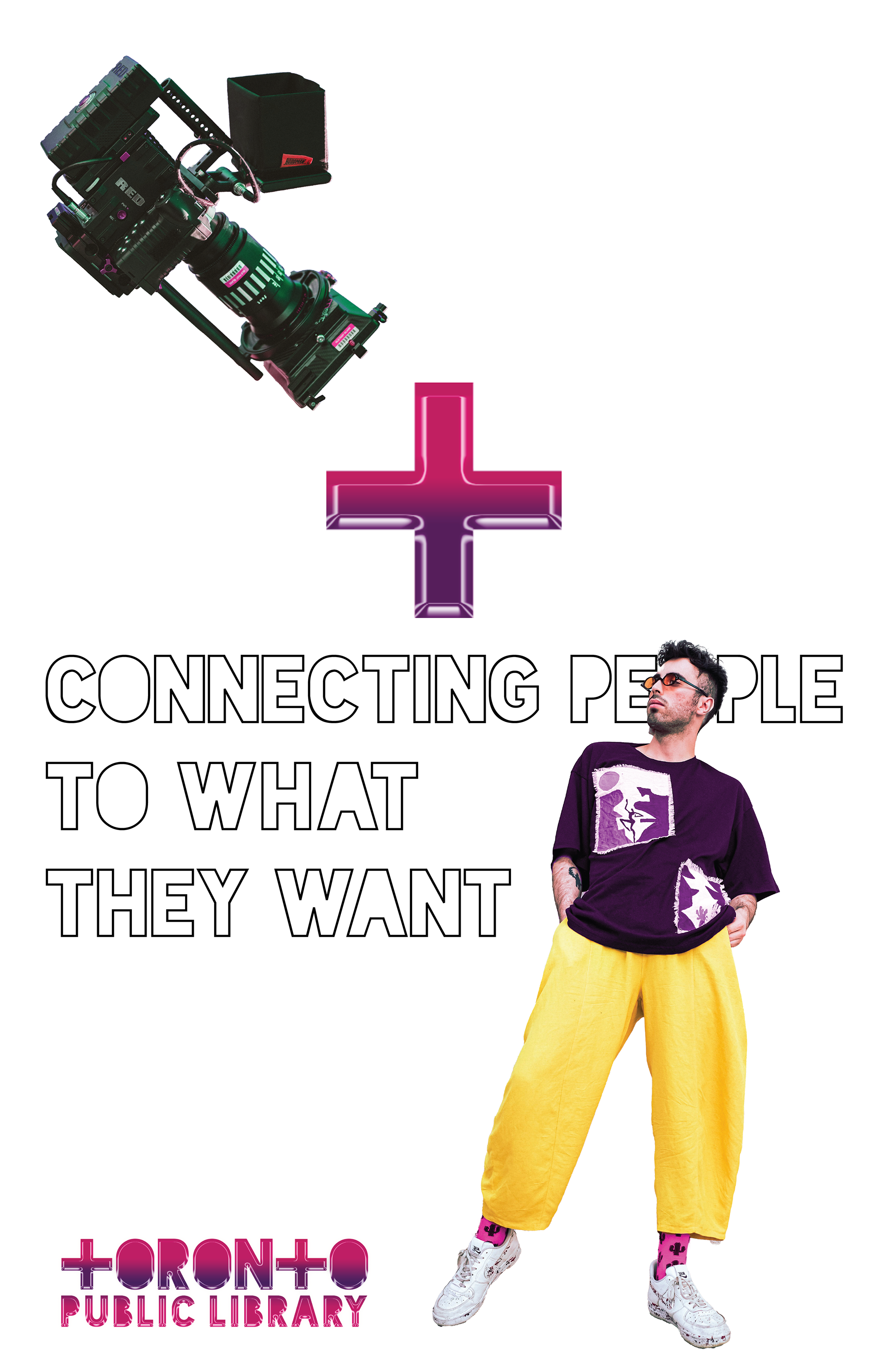
Poster
LinkedIn Header Image
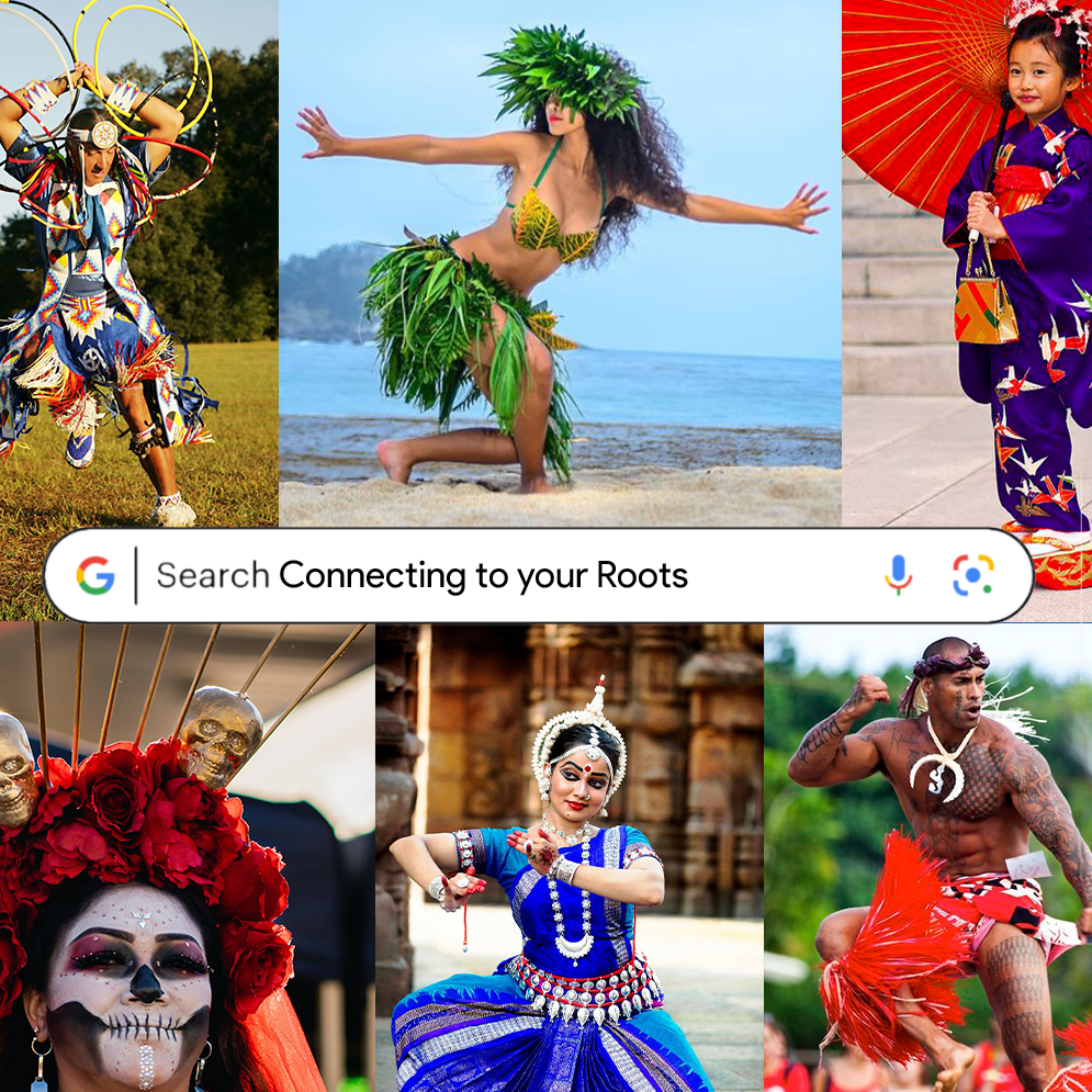
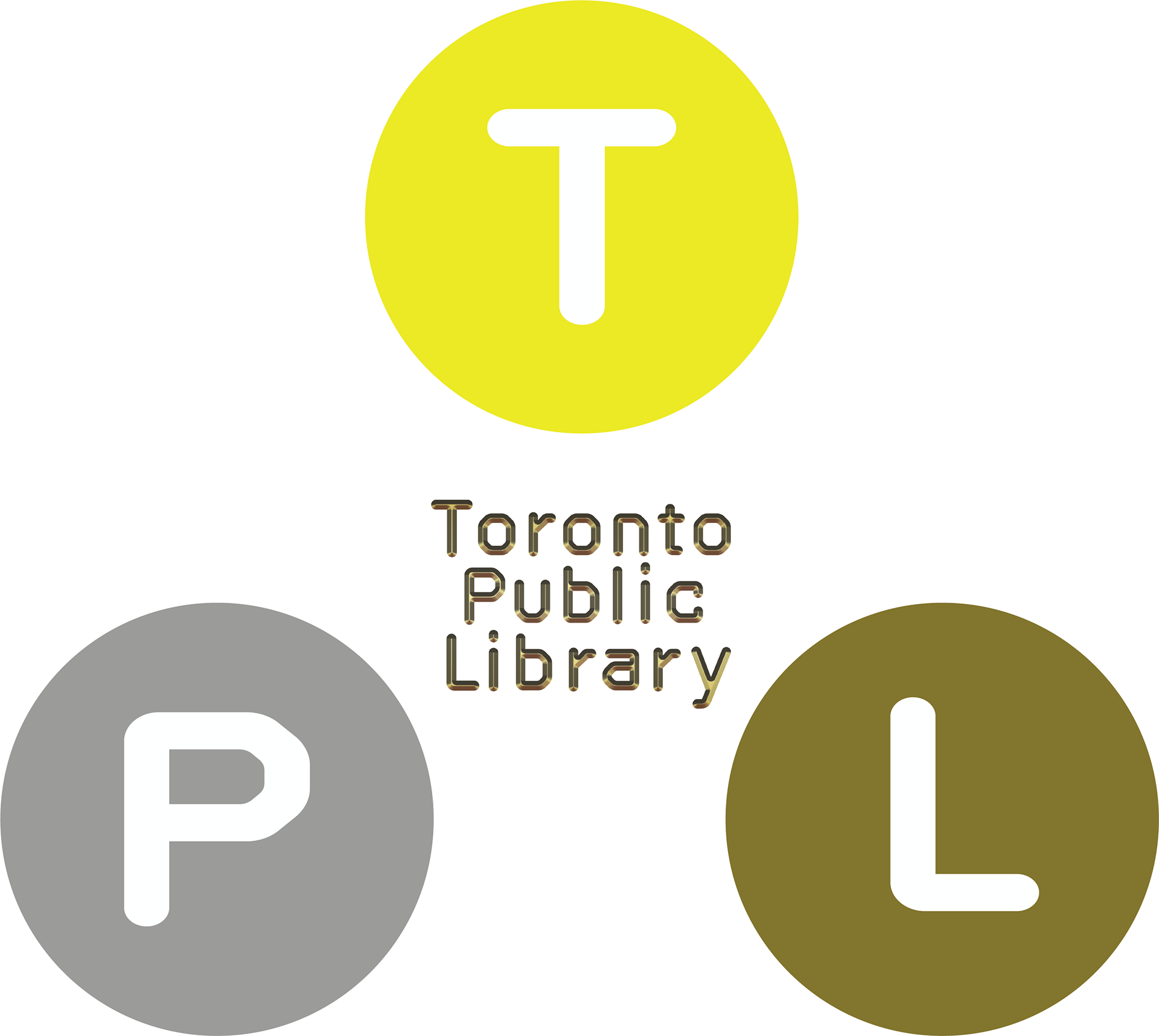
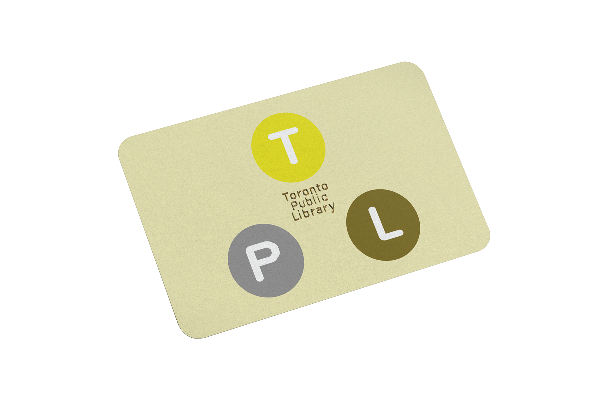
Direction: Connection

Strategy
INSIGHT: The library connects us by providing us with knowledge, entertainment and a safe place to commune.
Connection is at the core of what a library does. Public libraries connect everyone regardless of socioeconomic factors to meeting spaces, programs and events, technology, books, and much more.
Concept: The branding has a slight Y2K influence that is vibrant and bold. The T in Toronto is a plus symbol to be used to connect the imagery.
Business Card
Banner
Poster
Linkedin Header

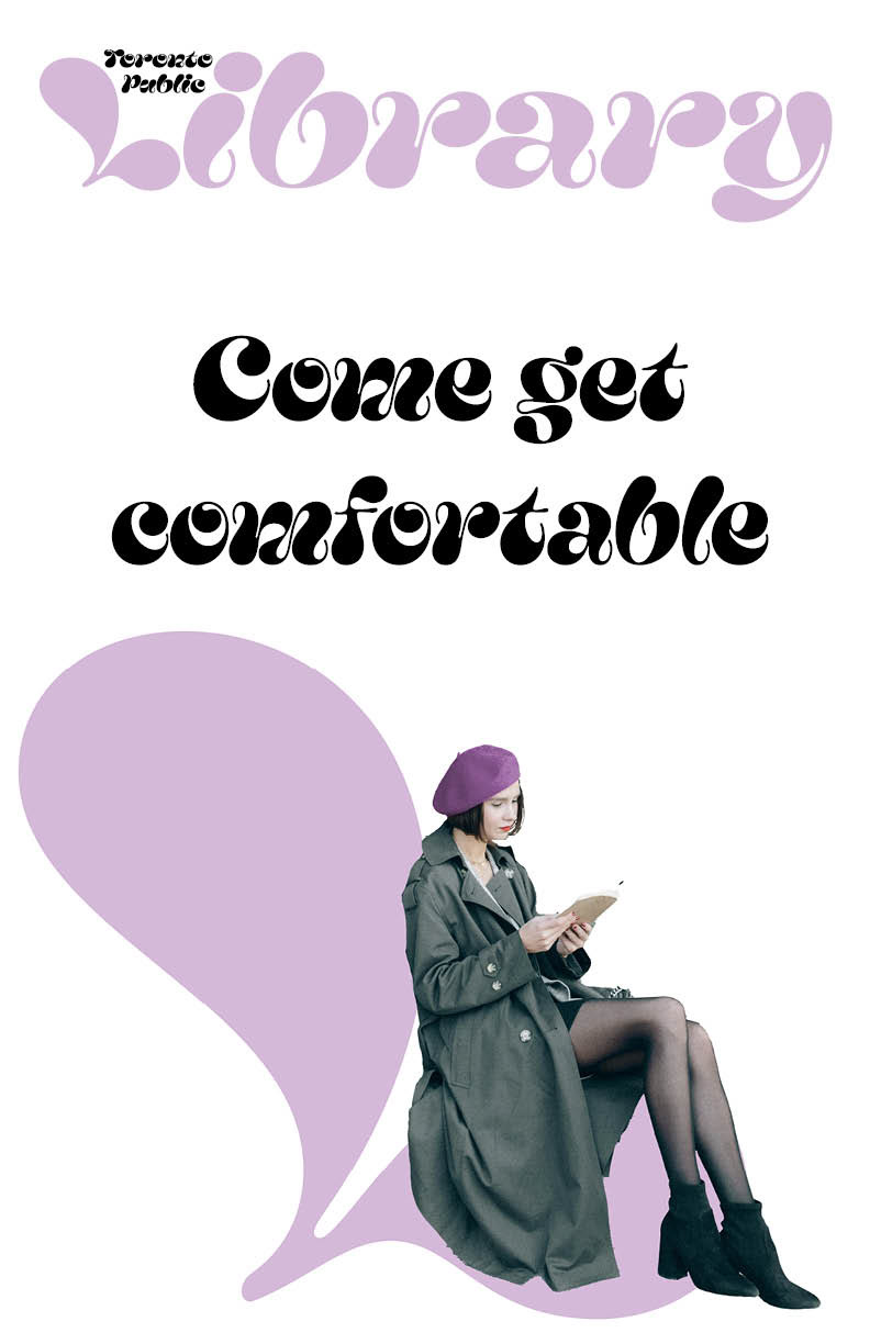
Direction: Comfort


Strategy
INSIGHT: The urban landscape is being built to keep people moving. The Toronto Public Library is a place you can go to relax
Hostile architecture or exclusionary design, is an urban design strategy in which public spaces and structures are used to prevent certain activities or restrict certain people from using those spaces. Fewer and fewer spaces are left for people to gather and commune.
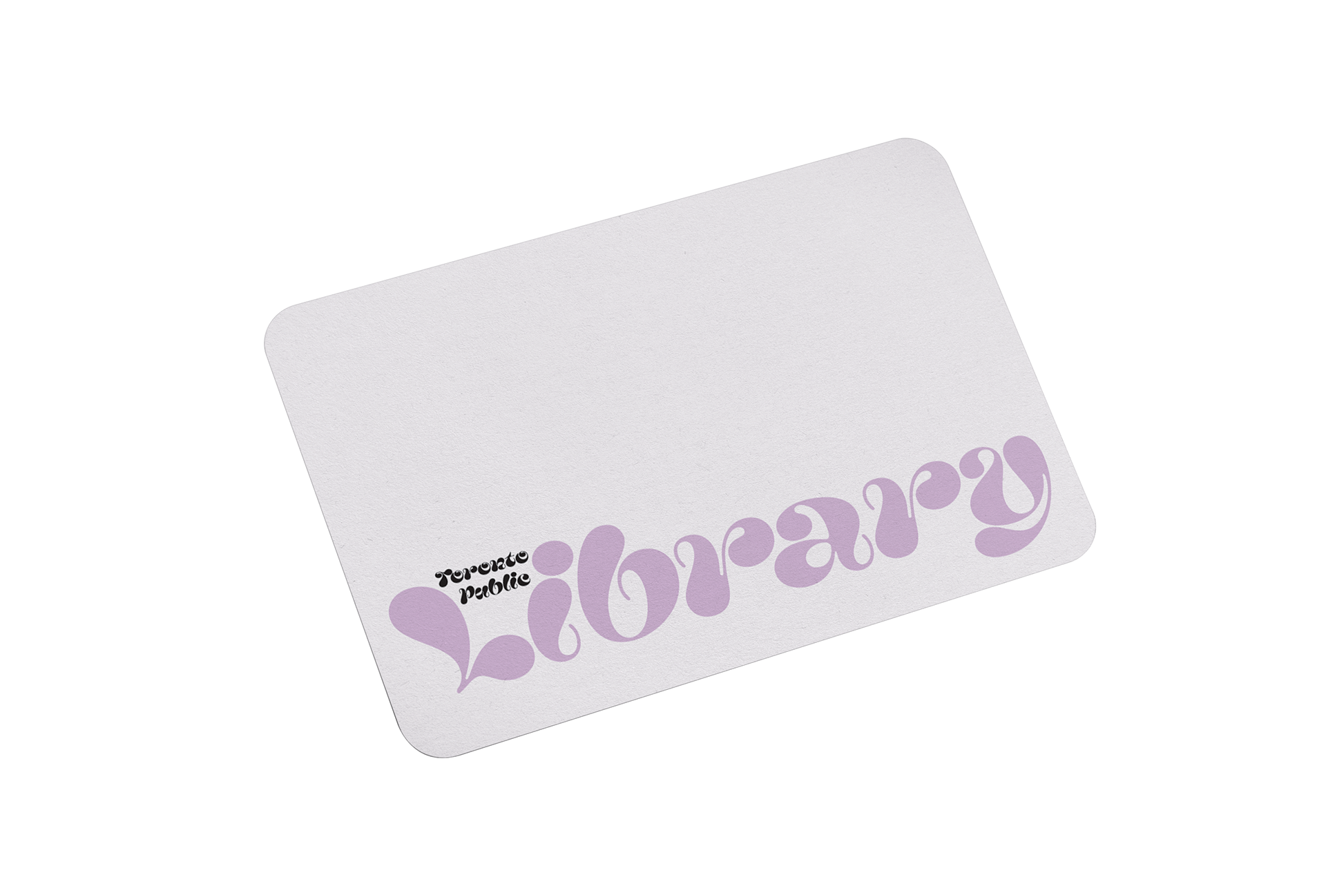
Concept: The branding is youthful and inviting. The curves of the typeface and pastel colours give a welcoming presence.
Concept: The branding is youthful and inviting. The curves of the typeface and pastel colours give a welcoming presence.
Business Card
Banner

Poster
Linkedin Header

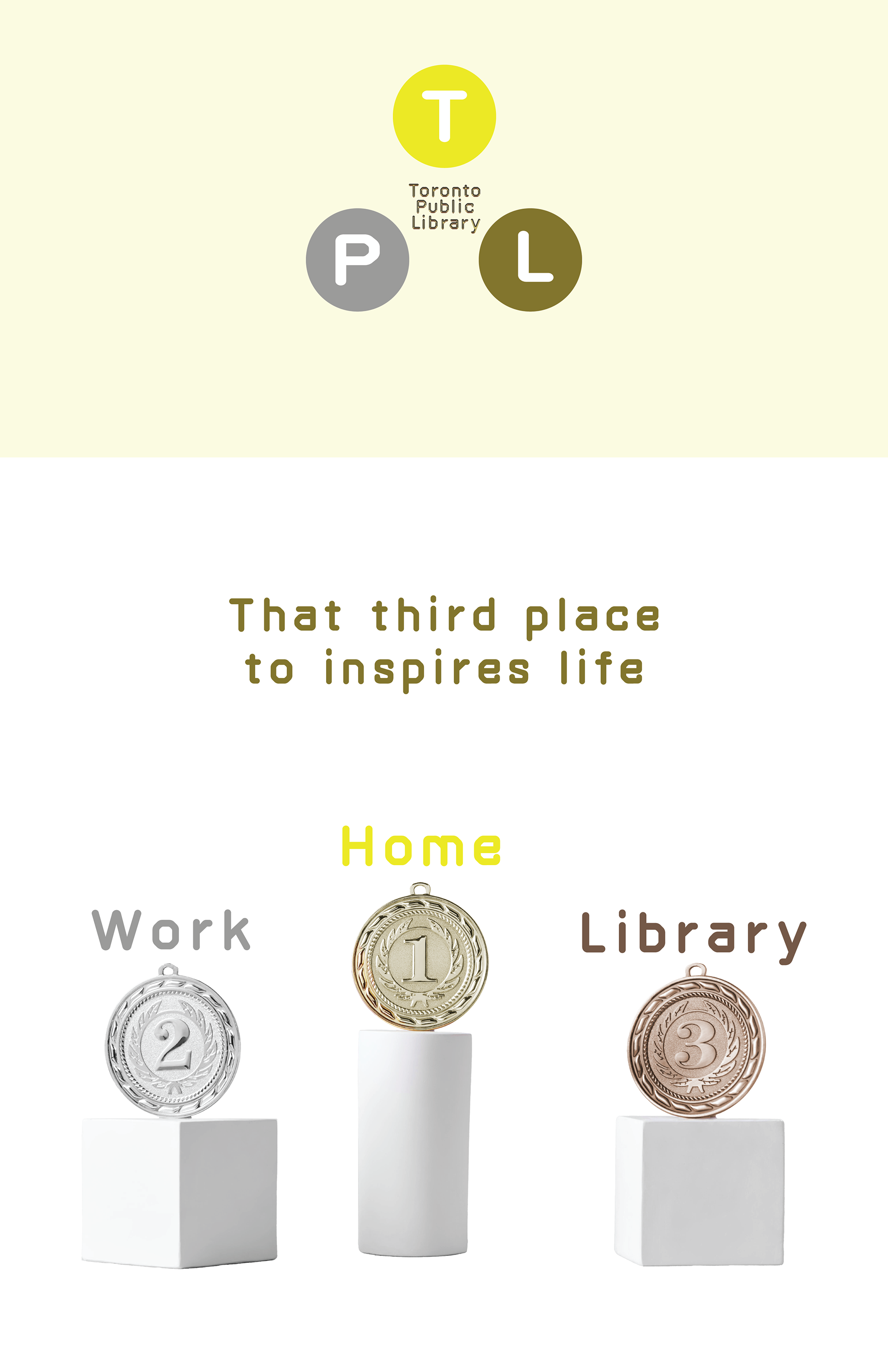
Direction: Third Place
Strategy
INSIGHT: Utilizing the third space is essential if you want to achieve balance in your life
The first place is the home.
The second place is the workplace/school, where people spend most of their time.
Third places are anchors of community life and facilitate and foster broader more creative interactions (Cafes, pubs, parks, and libraries are examples)
These spaces have been declining in recent years.
Libraries are one of the few third places that still exist
Concept: The branding symbolizes a competition pedestal.
The colours represent gold, silver and bronze. The library is bronze for the third place. Metallic lettering and flat logomark can be broken up and used as design elements.
The colours represent gold, silver and bronze. The library is bronze for the third place. Metallic lettering and flat logomark can be broken up and used as design elements.
Business Card
Banner

Poster
Linkedin Header